Spectoda Connect manual
Technical manual for Spectoda Connect: first launch, Devices, Scenes, Settings, and service tools.
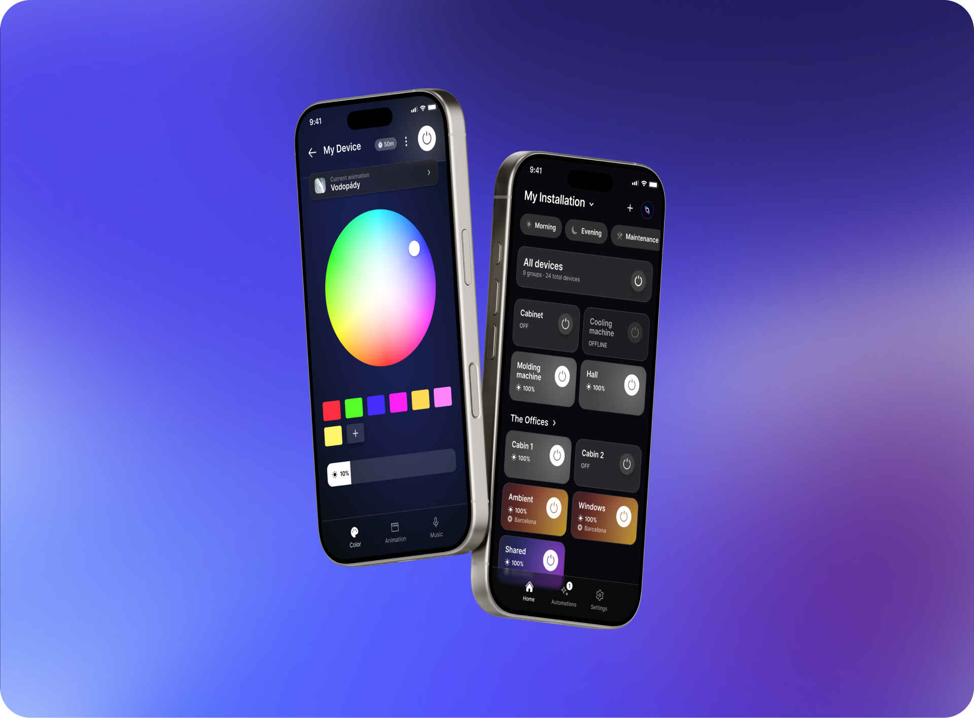
Spectoda Connect is the user interface for controlling and managing lighting installations built on the Spectoda ecosystem. The app usually communicates with Spectoda controllers through Bluetooth Low Energy.
In mobile app stores, the app is available as Spectoda Connect for iOS and Android.
This manual describes the technical structure of the app, the basic navigation, and the operational meaning of the main sections: Theme, Login, Devices, Elements, Settings, Account, Tools, and Updates. Its goal is to explain not only where each function is located, but also how it relates to the network, controllers, user permissions, device synchronization, and firmware or animation data updates.
Main functions
Spectoda Connect serves as the user interface for everyday control and basic management of a lighting installation.
Main app functions:
- Wireless light control - the app communicates with Spectoda controllers and lets users control the installation without a physical control panel.
- Intensity and color settings - depending on the element type, the app can control brightness, RGB color, or white color temperature.
- Automation and scenes - the app can trigger prepared lighting scenes, animations, and operating modes.
- OTA updates - the app supports data or firmware updates for devices, if they are available for the given network.
- Remote access - in installations with Spectoda Gateway, the app can also be used for remote control and service outside the local Bluetooth range.
First launch
On first launch, select the correct app environment and then sign in. This step determines which user interface is loaded and how the app works with available networks.
Spectoda Connect can contain multiple app variants. In addition to the current Spectoda App v3, older or customer-specific themes may also be available, such as legacy Spectoda App v2 or product apps created for specific installations.
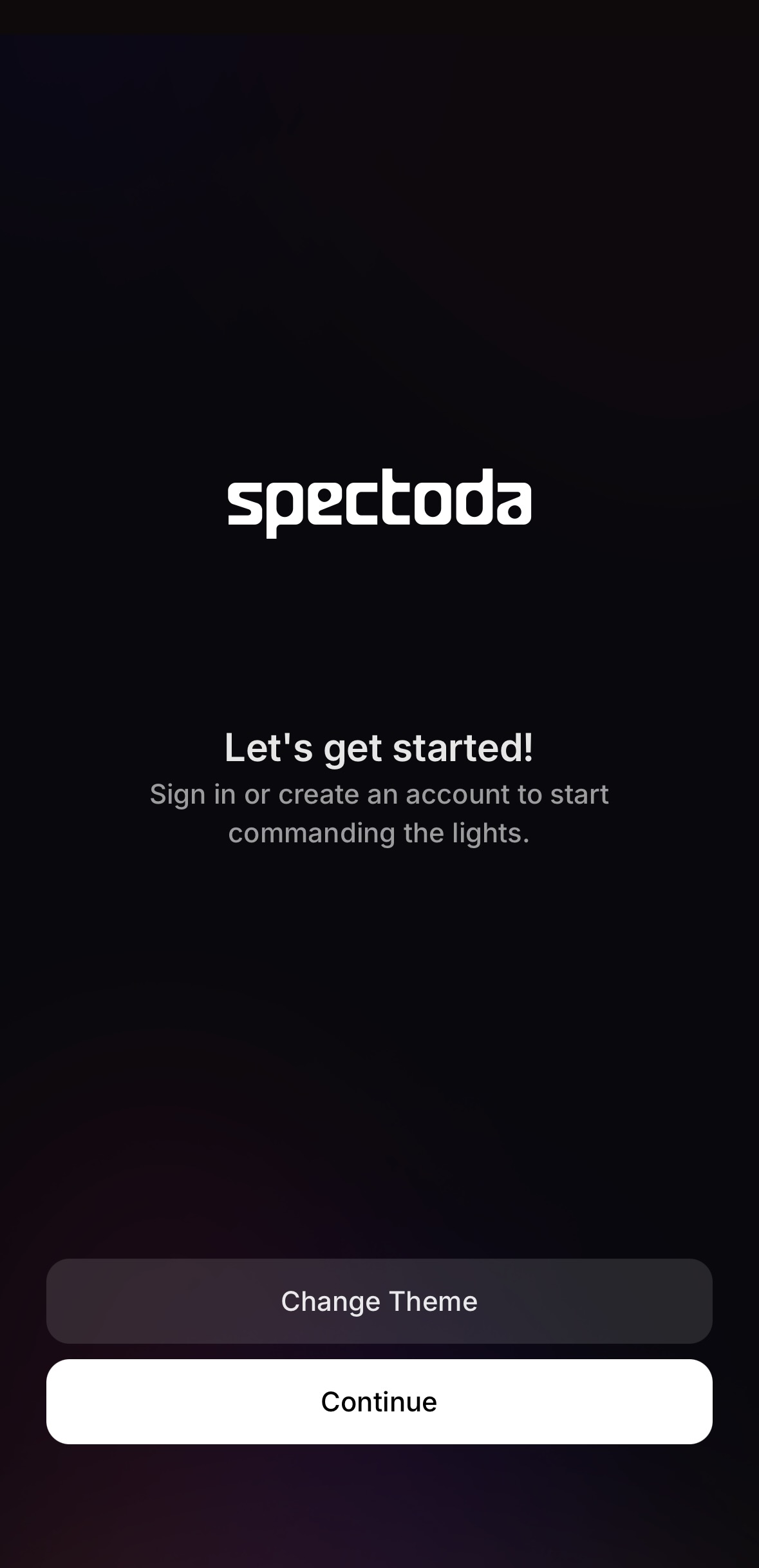
Theme selection
In this context, a theme is not only the visual appearance of the app. It determines which Spectoda Connect app variant will start. Theme selection is important mainly when working with customer apps, legacy projects, or specific product interfaces.
On first launch:
- Open Spectoda Connect.
- On the welcome screen, check the currently selected theme.
- If you need another variant, select Change Theme.
- Select the required theme according to the installation type or technician instructions, usually Default theme.
- Continue with Continue.
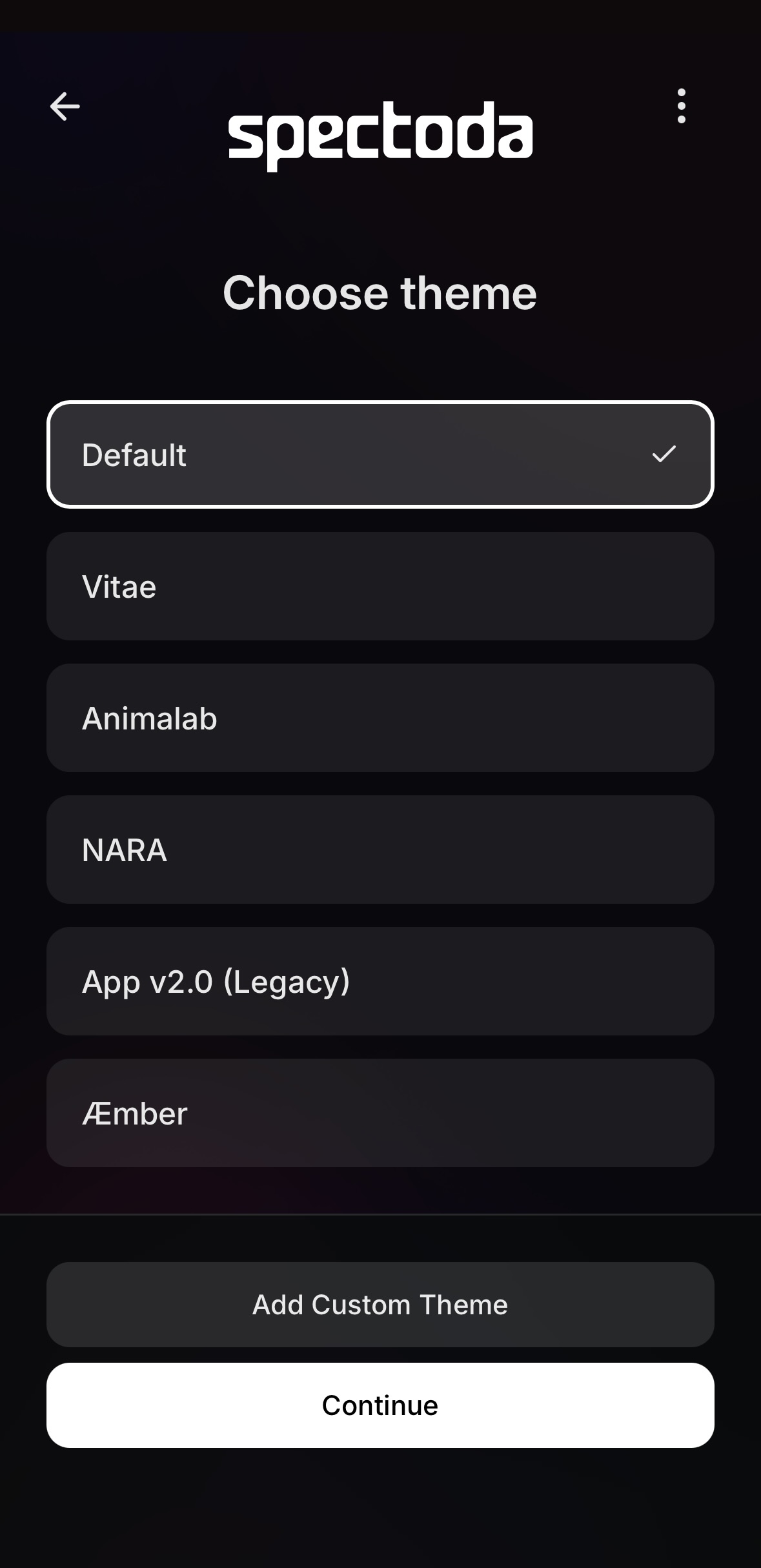
For standard new installations, use the Default theme, which corresponds to the current Spectoda App v3. Use the older App v2.0 (Legacy) only for installations that have not yet been migrated to e-mail sign-in or that still require the original access through a network name and password.
Customer themes, such as Vitae, Animalab, NARA, or AEmber, should be used only when they are part of a specific installation or product. If it is not clear which theme should be used, contact customer support or the responsible technician.
Signing in to Spectoda App v3
Access to networks is controlled by permissions assigned to the specific e-mail address that you provided to the technician during installation.
Steps:
- On the welcome screen, select Continue.
- Enter the user’s e-mail address.
- Continue with Continue.
- A verification code will arrive at the entered e-mail address.
- Enter the code in the app.
- After successful sign-in, the app loads all networks where the user has permission.
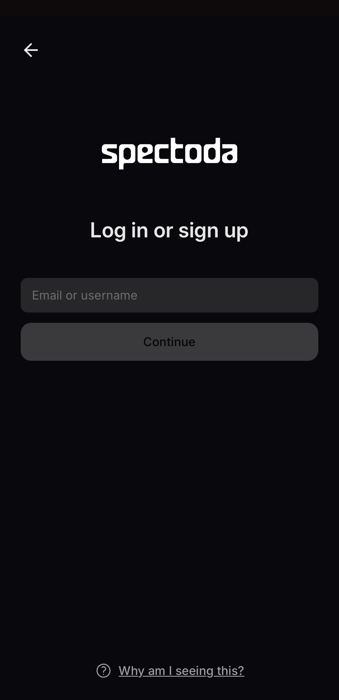
If no network appears after sign-in, the user probably does not have assigned access rights. In that case, verify the e-mail address used for sign-in and share access to the relevant network with that e-mail.
Main control panel
After successful sign-in, the user enters the main control panel of the selected installation. The default screen is Devices, which acts as the main overview of available devices and control elements in the selected network.
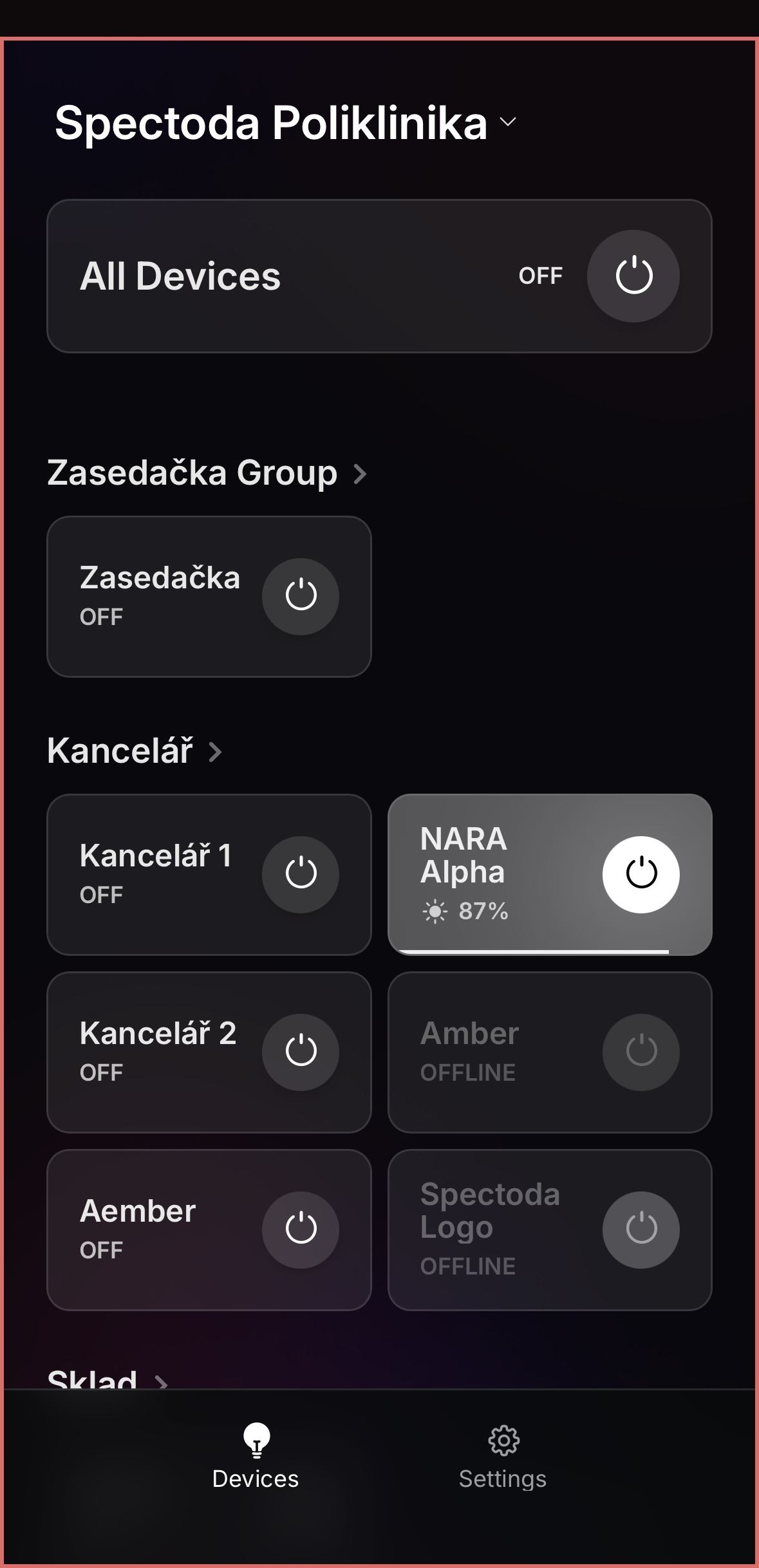
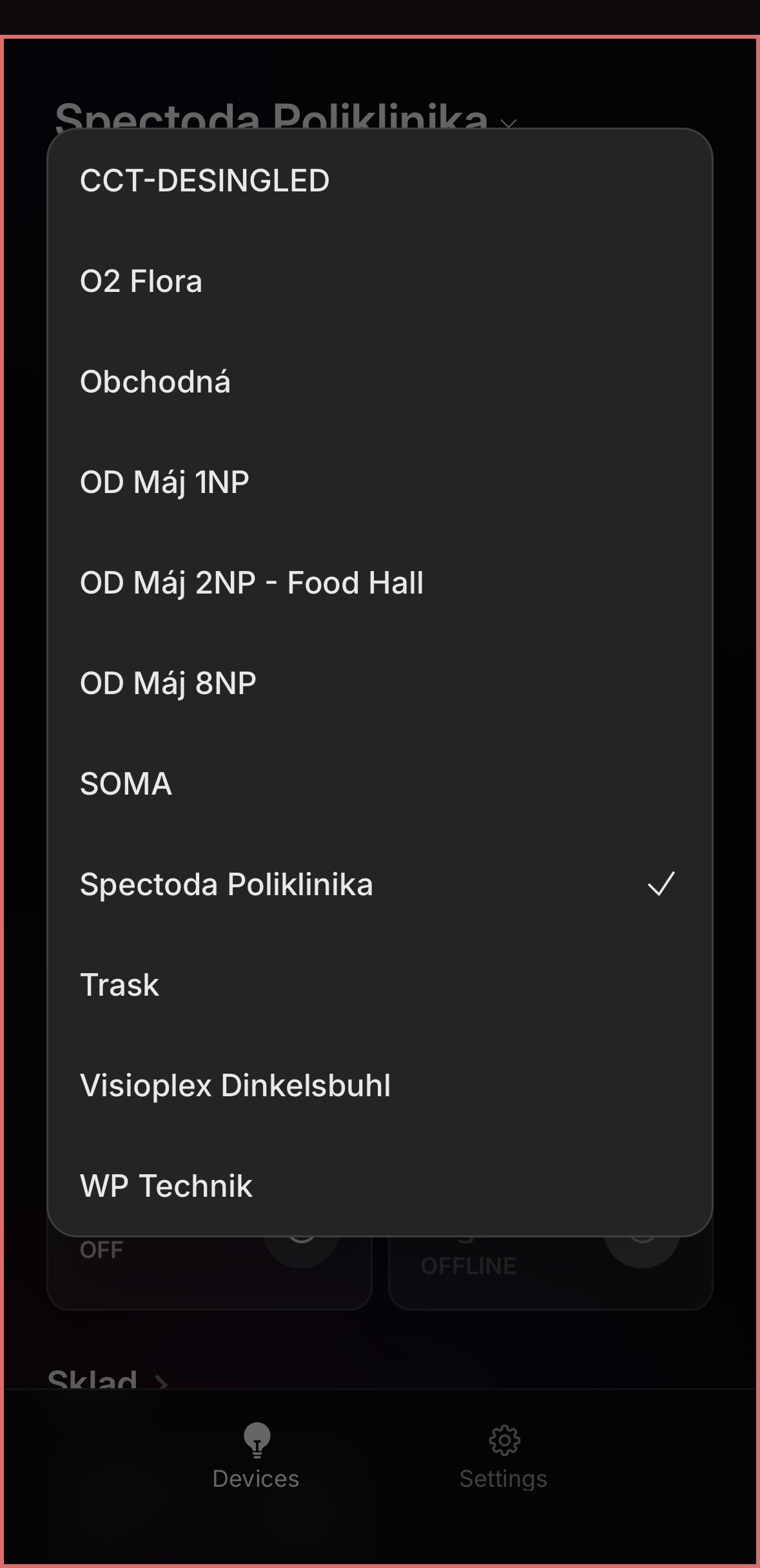
The name of the currently selected network is shown at the top of the screen. Clicking this name opens the list of networks available to the signed-in e-mail. If the user has access to multiple installations or networks, they switch between them here.
The bottom navigation contains the main app sections:
- Devices - the main control panel of the installation. It displays devices, elements, or control interfaces according to the configuration of the current network.
- Scenes - overview of prepared scenes for the current network, if they are available in the app.
- Settings - app settings and service section. It contains account management, tools, updates, and other operational functions depending on the available permissions and selected theme.
The list of available networks is linked to the e-mail used for sign-in. If the user expects another installation and does not see it in the menu, check whether access to that network has been shared with the e-mail address.
Devices
The Devices section is the main control page of the currently selected network. It displays control elements used to turn parts of the installation on or off, and in some cases to adjust them. The contents of this page can differ depending on the configuration of the specific network.
All Devices
The All Devices element is usually displayed at the top of the page. This element works as global control for the whole installation.
The All Devices function:
- turns all available parts in the current network on or off,
- gives a quick overview of the overall installation state,
- acts as the first diagnostic point for checking whether the installation responds to commands from the app.
If All Devices is OFF, the app sends a command to turn the whole installation off. If it is ON, the app sends a command to turn on all relevant parts according to the network configuration.
The All Devices element usually has a wider card than standard elements. The card contains the element name, current state, and the main on/off button for the whole installation. This element is useful for quickly checking that the app communicates with the installation as a whole.

Element groups
Below the global control, the remaining elements are usually divided into groups. A group represents a logical part of the installation, such as a room, zone, floor, or functional unit.
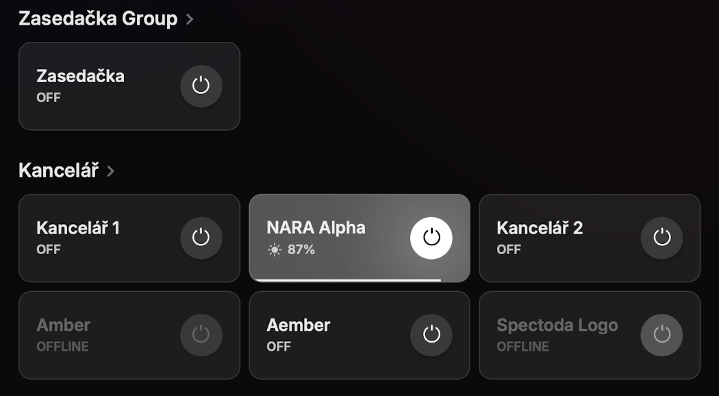
In the example screen, groups include:
- Zasedacka Group - group for controlling the meeting room,
- Kancelar - group for controlling elements in the office area.
Groups keep control manageable in larger installations. They let users first orient themselves by area instead of searching for a specific controller in one long list.
Individual elements
Inside groups, there are individual control elements. They typically correspond to specific controllers, luminaires, zones, or other controlled parts of the installation, depending on how the network was prepared in Spectoda Studio.
Each element usually contains:
- the name of the controlled part of the installation,
- the current state, for example ON, OFF, or OFFLINE,
- the main control button for turning it on or off,
- additional information, such as brightness or another parameter, if available for the element.
Example: Kancelar 1 can correspond to one controller or one lighting zone in an office. NARA Alpha also shows the current brightness value, because this element type supports continuous intensity control.
The element card can differ depending on type and state:
- Basic ON/OFF element - displays the name, state, and round power button. It is used for simple on/off control of a specific part of the installation.
- Element with a parameter value - in addition to the name and button, it displays a current value, such as brightness in percent. In the NARA Alpha element, the 87% value and the bottom level indicator are visible.
- OFFLINE element - the card is visually muted and the state is marked as OFFLINE. The control button may be inactive or gray because the app does not currently have confirmed communication with that element.
Clicking the round button on a card sends the basic ON/OFF command for the element. Clicking the card itself or the group name can open more detailed control for the given element or group, if available in the app configuration.
Control page types
Individual elements in Devices can open different types of detailed control pages. The page type is determined by the network configuration and defines which controls the user will see after opening the element.
ON/OFF
Purpose: Simple on/off control of a specific element, zone, or controller.
The ONOFF page is used for elements that need only binary control. The user sets the basic ON or OFF state without additional parameters.
What it can do:
- turn an element on,
- turn an element off,
- display the current state of the controlled part of the installation.
Brightness
Purpose: Setting light intensity.
The DIMMA page is used for dimmable elements. The user sets the brightness of a specific zone, light, or device group with a simple slider.
What it can do:
- set the brightness level,
- display the current intensity value in percent,
- send the brightness change to the relevant controllers in the network.
The page displays a slider with a light icon and the current value, for example 100%. This page type is suitable for elements where the user only controls light intensity without changing color or other parameters.

Color
Purpose: Setting light color.
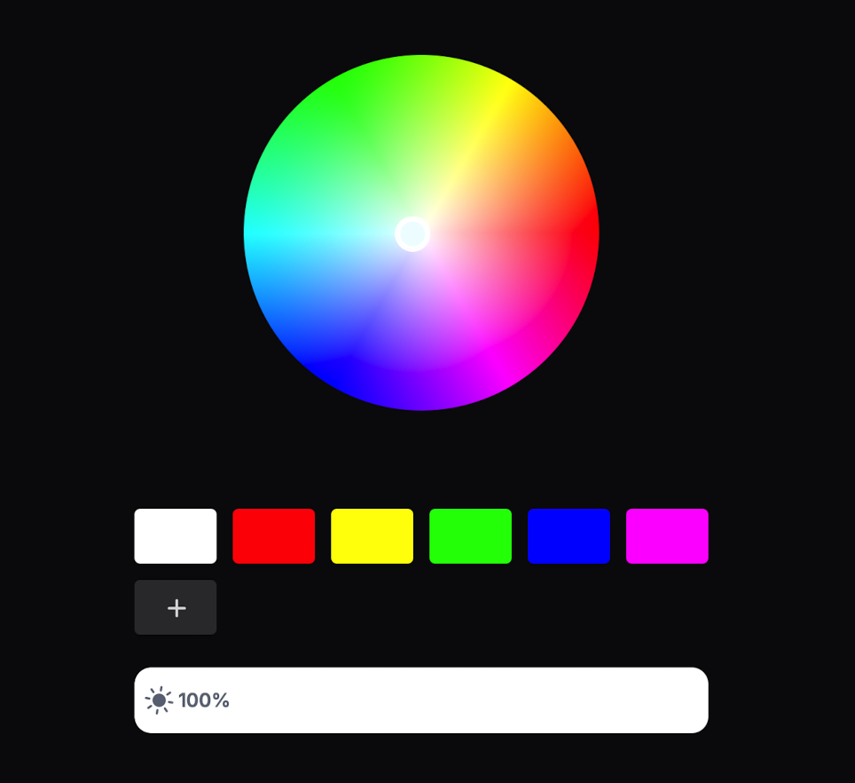
The COLOR page is used for elements that support color outputs, typically RGB or RGBW. The user changes the resulting light color with a color wheel and quick color options.
What it can do:
- select any color using the color wheel,
- use quick color swatches,
- add another color option if the configuration allows it,
- set brightness intensity,
- change the color output of a compatible element,
- work with color channels according to the controller type.
This page type is suitable where the user should freely set the light color instead of choosing only from prepared presets. Compared with PICKERS, it gives broader manual control over the resulting color.
Animations
Purpose: Selecting or starting animations.
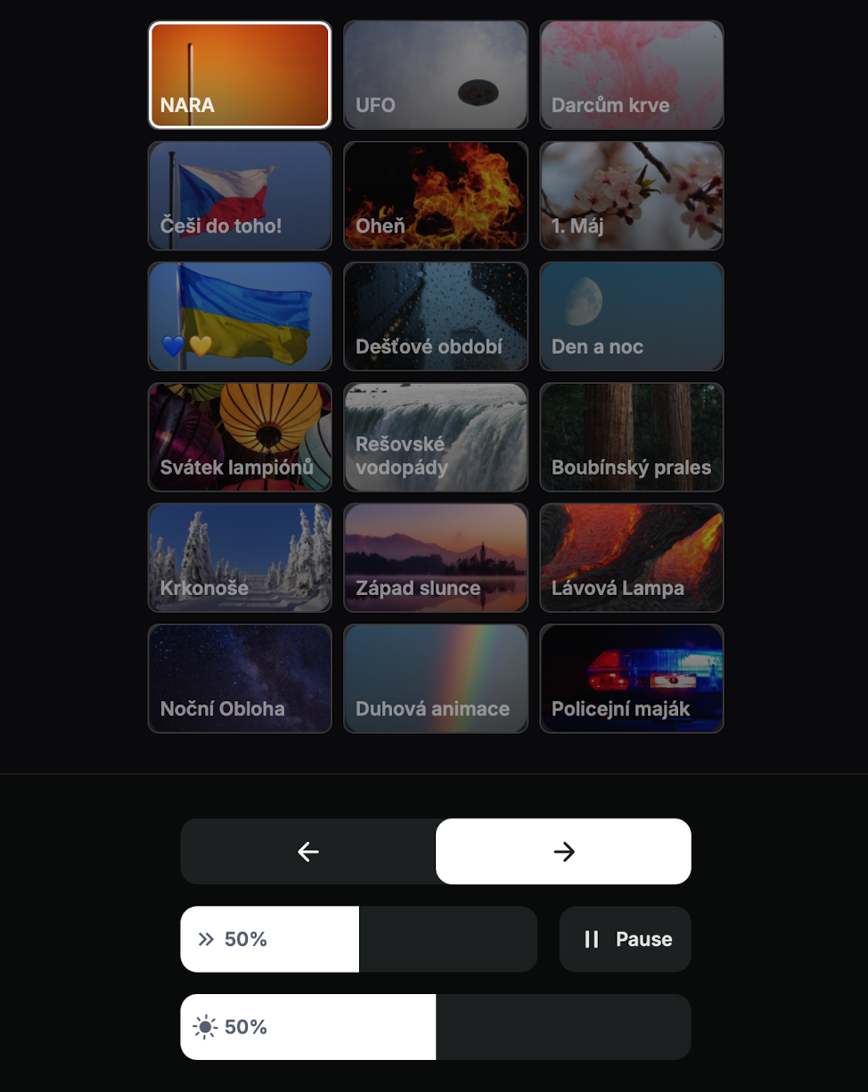
The ANIMA page is used for elements that have prepared lighting animations. The user selects an animation mode or effect according to the network configuration. Animations are displayed as tiles with a preview and name, for example NARA, Fire, Day and night, Sunset, or Police beacon.
What it can do:
- display available animations,
- start the selected animation,
- switch between animations using arrows,
- pause animation playback with Pause,
- adjust animation speed or progress if available for the effect,
- set animation brightness intensity,
- control animated light behavior where supported.
Controls at the bottom of the page are used for the currently selected animation. The exact available parameters can differ depending on the animation type and network configuration.
Color picker
Purpose: Selecting a color through a picker or prepared color options.
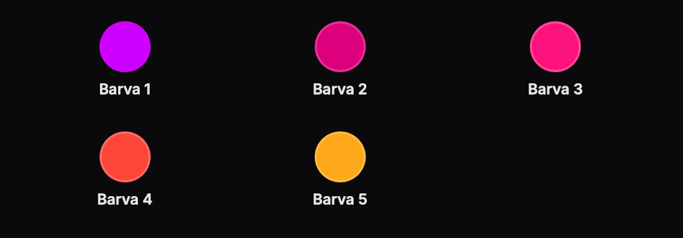
The PICKERS page is used for color control through prepared color options. The user selects from several color presets displayed as circular swatches with names, for example Color 1, Color 2, or Color 3.
What it can do:
- display preset color options,
- select a specific color with one click,
- send the selected color preset to compatible elements,
- name color options according to the network configuration,
- make color control clearer for regular users.
This page type is suitable where the user should not freely set any color, but should choose from a prepared color set. This keeps control fast and predictable.
CCT
Purpose: Setting white color temperature.
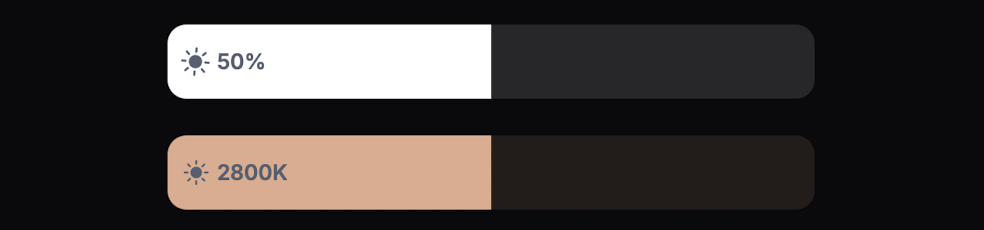
The CCT page is used for elements that support changing white color temperature, such as warm/cool white or biodynamic lighting. The user sets the color temperature according to the options of the specific controller and luminaire.
What it can do:
- set white color temperature,
- switch between warmer and cooler light,
- control CCT channels of compatible controllers,
- provide settings for zones where working with white light is important.
Schedule
Purpose: Setting automatic on/off operation by time.
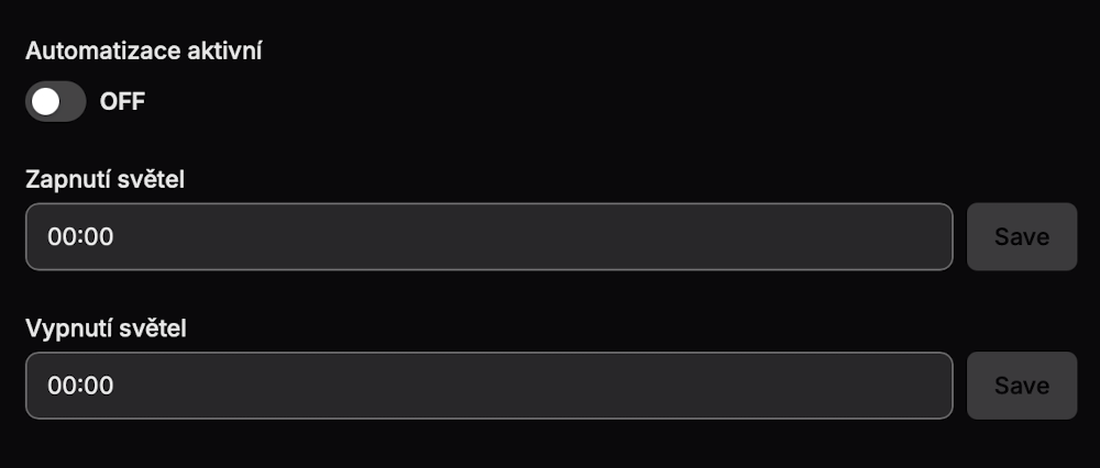
The Schedule page provides simple time-based control of the installation. The user sets when lights should turn on automatically and when they should turn off automatically. This type of control is suitable for installations with regular operation, such as offices, showrooms, venues, or public spaces.
What it can do:
- activate or deactivate time automation,
- set the automatic light-on time,
- set the automatic light-off time,
- save the on time and off time separately,
- reduce the need for manual control during regular daily operation.
The Automation active toggle determines whether the schedule is enabled. If automation is disabled, the configured times are not used. The Lights on field determines when the app or installation starts turning the lights on. The Lights off field determines when the lights turn off. After changing a time, use the Save button for the relevant field.
The schedule sets regular automatic behavior for the installation. If the user needs to change the current light state once, they should use standard control in Devices or prepared Scenes.
Element state
The element state tells how the app currently evaluates the given part of the installation.
- ON - the element is on or active.
- OFF - the element is off.
- OFFLINE - the app is not currently communicating with the element or the element is unavailable.
The OFFLINE state does not always mean a fault. It can be caused by a powered-off controller, missing Bluetooth range, missing power, or a temporary state before synchronization. During diagnostics, check power, the selected network, and device availability in the installation.
Scenes
The Scenes section is a main app section on the same level as Devices and Settings. It is used to select and start prepared scenes in the current network.
A scene typically represents a preset installation state or mode. It can be a lighting atmosphere, operating mode, event mode, or a combination of multiple settings at once.
Scenes are shown in the app as simple tiles with names. In the example, the available scenes are Provoz, Uklid, and Vypnuto. Clicking a tile starts the corresponding mode prepared in the network configuration.
What the Scenes section can do:
- display available scenes for the current network,
- start the selected scene,
- switch the installation into a prepared mode,
- affect multiple elements or zones at once according to the scene configuration.
This section is useful where the user should not manually set individual elements in Devices, but should choose from ready-made scenes prepared by a technician or network creator. It is typically used to switch quickly between normal operation, cleaning mode, and turning the installation off.

Settings
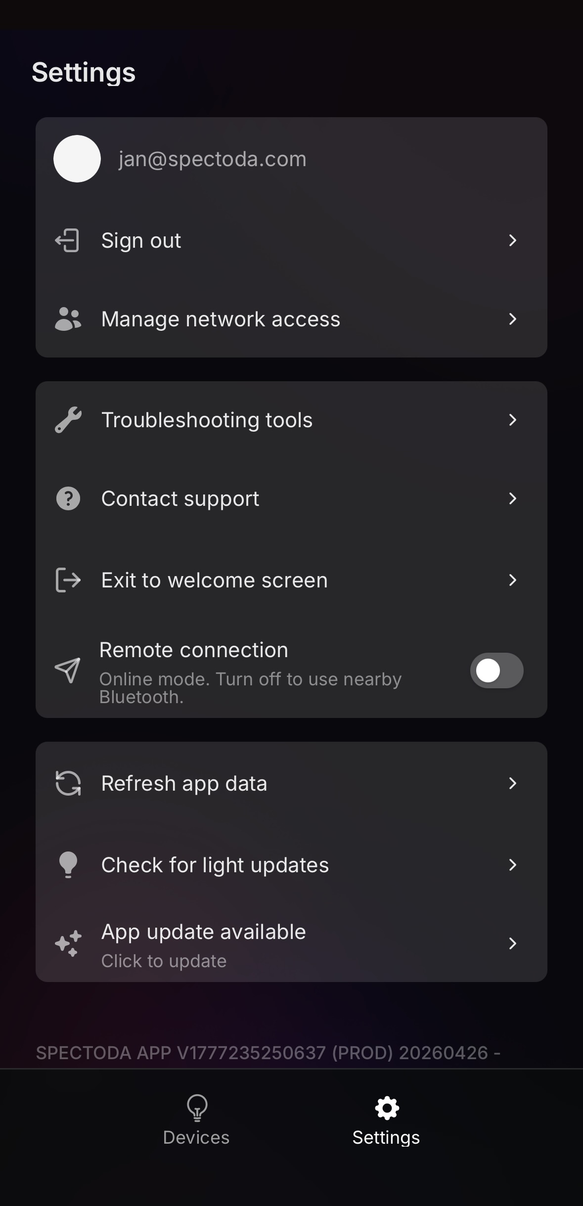
The Settings section is used for managing the app, user account, service tools, and app data. It is available from the bottom navigation next to Devices.
Settings content is divided into three main areas:
- User area - signed-in account, sign-out, and network access management.
- Tools - operational and diagnostic tools.
- App data - data refresh, light update checks, and app updates.
User area
The top block of Settings is linked to the currently signed-in user. It displays the account e-mail used by the app and contains actions related to network access.
The user area contains:
- Signed-in user e-mail - identifies the account used by the app to load available networks.
- Sign out - signs the user out of the app. After signing out, the user needs to sign in again with e-mail and a verification code.
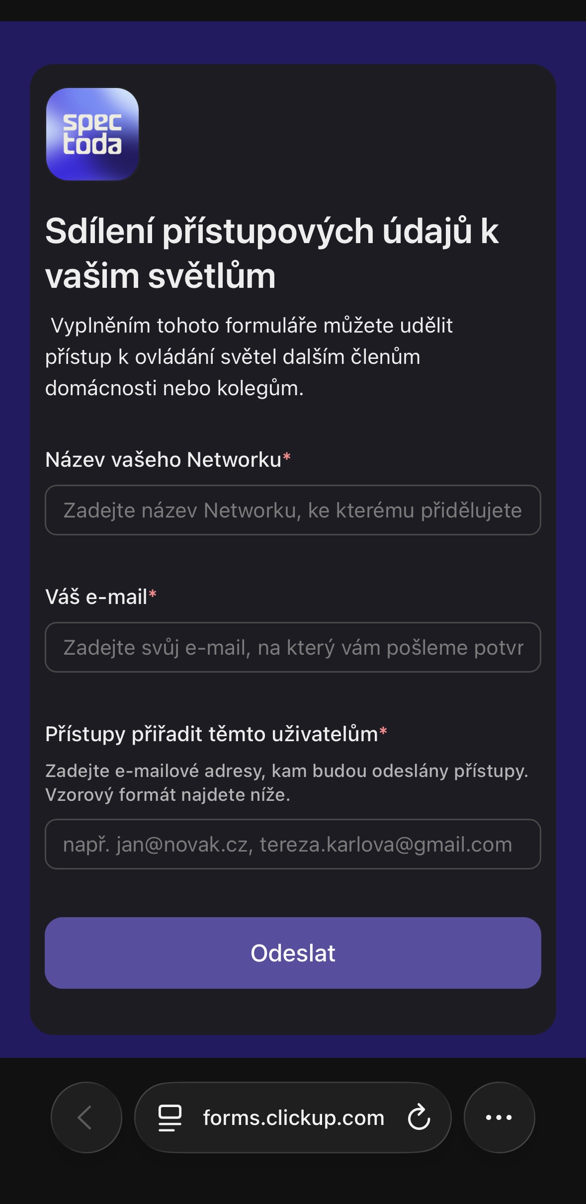
- Manage network access - opens a form for managing or requesting shared access to a network.
Manage network access
Manage network access is used to give additional users access to light control. It is used when the same network should be available to another household member, colleague, building manager, or service technician.
After opening the form, fill in:
- Network name - the network where access should be assigned.
- Requester e-mail - the e-mail address of the person sending the access request.
- New user e-mails - addresses of users who should receive access.
Access is linked to a specific e-mail address. If the user signs in with another address, the app may not show the expected network even if access exists for a different e-mail.
Troubleshooting tools
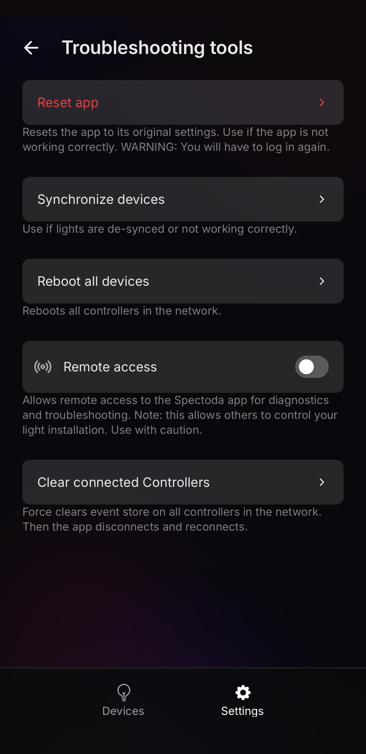
Troubleshooting tools opens a screen with advanced service actions for the current network. It is used when troubleshooting issues with the app, light synchronization, controller communication, or remote diagnostics.
Reset app
Reset app restores the app to its default state. It is used when the app does not work correctly, does not load data, or behaves unexpectedly.
After reset, the user will be signed out and will need to sign in again with e-mail and a verification code.
Use it, for example, when:
- the app repeatedly freezes or does not load the interface,
- old data remains in the app after changing a network,
- simply closing and reopening the app did not help.
Reset app does not delete network settings or controller configuration, but it clears the local app state on the user’s device. Use it only after normal closing and reopening does not help.
Synchronize devices
Synchronize devices resynchronizes lights and controllers in the network. It is used when lights do not respond correctly, are out of sync with the app, or behave as if desynchronized.
Typical uses:
- lights do not respond to a state change from the app,
- some parts of the installation behave differently from others,
- after a change or service intervention, device state needs to be unified.
Synchronization applies to the currently selected network. Before running it, check that the correct network is selected at the top of the app and that the phone is within installation range if working over Bluetooth.
Reboot all devices
Reboot all devices restarts all controllers in the current network. It is used during diagnostics when controllers need to be reinitialized without physically disconnecting power.
After running it, the installation may be unavailable for a short time. The app can disconnect during the restart and then reconnect.
Use it, for example, when:
- some controllers stopped responding,
- synchronization did not help,
- the installation shows inconsistent state across multiple elements.
After the restart, wait for a moment until the controllers reconnect and the app loads the current state.
Remote access
Remote access enables remote access for diagnostics and troubleshooting. When enabled, support or a technician may be able to help solve the issue remotely.
This feature is used mainly during remote service. It allows troubleshooting without the technician being physically present at the installation, if the conditions for remote connection are met.
Remote access allows remote intervention in the lighting installation. Enable it only when remote support is needed, and turn it off again after diagnostics are finished.
Clear connected Controllers
Clear connected Controllers forces the event store to be cleared on all controllers in the network. The app then disconnects and reconnects.
It is used for deeper communication diagnostics or when controllers are connected but the app works with outdated or inconsistent state. Use this function carefully, ideally according to technician or support instructions.
Typical uses:
- the app sees controllers, but device state does not match reality,
- after a service intervention, inconsistent communication state remains in the app,
- normal synchronization and rebooting all devices did not solve the issue.
After running it, expect a short app disconnect. Reconnection can take several seconds depending on network size and controller availability.
Contact support
Contact support is used to quickly contact Spectoda support. Use it when the problem cannot be solved with normal app steps or technician help is needed.
After clicking it, the support form opens: Contact support.
Before contacting support, prepare:
- the current network name,
- the signed-in user’s e-mail,
- a description of the problem,
- information about whether the problem is permanent or appears only sometimes,
- a screenshot if the app shows an error state.
Depending on the problem, support may ask you to enable Remote access or perform one of the Troubleshooting tools steps.
Exit to welcome screen
Exit to welcome screen returns the app to the welcome screen. It is used mainly when the app theme needs to be changed, the entry screen needs to be checked, or the user needs to return before the sign-in flow.
This action is not the same as Sign out. The user is not necessarily signed out of the account, but leaves the current app interface and returns to the welcome screen, where Change Theme is available.
Typical uses:
- checking or changing the theme,
- returning from a specific customer app to the welcome screen,
- diagnosing a first-launch issue.
Remote connection
Remote connection switches how the app communicates with the installation. When enabled, the app uses online mode for remote control. When disabled, the app works with nearby devices over Bluetooth.
Remote connection is useful when the installation should be controlled or checked remotely and the network has the required infrastructure for remote operation.
For Remote connection to work, the installation must include Spectoda Gateway GEN2. Without Gateway, reliable remote control outside the local Bluetooth range is not possible.
Bluetooth mode is suitable for local service, first diagnostics on site, or situations where remote connection is not available.
If the app does not respond as expected, check whether the correct connection mode is selected. For local work at the installation, you may need to disable Remote connection so the app uses nearby Bluetooth.
App data
The App data section contains functions for refreshing local app data, checking available light updates, and updating the app itself. These items are used during routine maintenance and diagnostics when the app displays outdated state or a newer version is available.
Refresh app data
Refresh app data reloads app data for the currently signed-in account and selected network. It is used when the app shows old state, an outdated network list, or changes made outside the current app session.
Use it, for example, when:
- the expected network does not appear after access changes,
- the app shows outdated configuration,
- the app user interface has changed,
- after a service intervention, you need to reload data without signing the user out.
Check for light updates
Check for light updates checks for available updates for lights or controllers in the current network. It is used during installation maintenance or when you need to verify whether devices are ready for a newer version of data, animations, or firmware according to the app configuration.
Before running it, check that:
- the correct network is selected,
- the phone is within installation range if working over Bluetooth,
- devices are powered and available,
- for remote work, Remote connection is working and the installation has Gateway.
App update available
App update available appears when a newer app version is available. Clicking it starts the update process according to the platform or current distribution method.
We recommend updating the app especially when:
- the app offers a new version directly in Settings,
- support asks for an update before further diagnostics,
- some functions in the manual do not match the currently displayed app version.
The current app version is also displayed at the bottom of Settings. It is useful to include this information when communicating with support, because it helps verify whether the user is on the current production version.
Frequently asked questions
Does Spectoda Connect support smart assistants?
Not currently.
Can multiple people control lights from the app?
Yes. Access to a network in the current app is linked to a user account, meaning an e-mail address.
Each user signs in with their own e-mail and verification code. Access to a specific network must be shared with that e-mail through access management.
Two devices can be connected to one controller or luminaire over Bluetooth at the same time.
Is Spectoda Connect available for free?
Yes. Spectoda Connect is available free of charge for iOS and Android.